Marian L Thorpe
Author of the Empire’s
Legacy series.
Editor and Publisher,
Arboretum Press.
I’ve been reading and reviewing indie
paperbacks for some years now. I also read a lot of traditionally published
work. I also run a small indie press, producing a handful of books by several
authors each year.
Something too few self-published authors, and,
to be fair, micropress publishers, fail to consider is the interior design of
their books. We know covers matter, but inside that cover, a book is more than
its words: its story should be set off by good interior design the way good
framing sets off a picture. Established publishers know this, and they have art
and layout departments dedicated to this. They know a reader, even when
attracted by the blurb, will open that book, flip through it, and if the
interior turns them off, they are unlikely to read it. Indie authors and little
presses rarely have design expertise, but there are still simple things that can
be done easily and will improve the interior appearance of a book.
I may run a very small press, but the books we
produce are competing against those published by big houses, and when a
customer picks up one of our books in a bookstore, I don’t want it to be the
interior design that makes them put it down. I want it to look no different
than the others. (If your work is avant-garde or experimental, you have good
reason to want a different look. But if you’re not, then my view is why start
off one step – or more – behind?)
So – what’s important?
Justification
Pick up any traditionally published book,
paperback or hardback, and almost without exception the text is fully
justified. Almost nothing screams ‘self-published’ to me as much as left-only
justification. Any word-processing program will fully justify a manuscript, and
yes, you do get some odd spacing occurring. Often those are caused by a hard return
where there shouldn’t be one, and sometimes it’s because of very long words.
It’s not my intent here to list all the solutions but one: google it, including
in your search the WP program you’re using. The answers are out there!
Spacing
Between-line spacing does depend to some extent
on genre, but generally you’re looking for about 32 – 38 lines per page for an
adult book, if every line is text. Unless there is a scene break, paragraphs
should not be separated by a space!
Scene breaks.
If you decide to mark scene breaks, whether
time shifts or POV changes, with a marker (and it’s not necessary: you can just
use extra blank lines), you can use the conventional three (or five) asterisks.
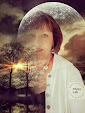
But there are other options. Consider using a symbol appropriate to the story
for a POV change, as seen here. (This book has a rural, Prairie setting.)
Picture 1: Scene Break

I have seen some creative uses: different
symbols for different speakers, for example, but don’t go overboard. You want a
clean interior, not clutter.
Chapter placement
First chapters start on a right-hand page.
After that, well, there was a time when all chapters started on a right-hand
page, even if that meant the opposing page was blank, and this convention is
still used sometimes in non-fiction. But it has been abandoned in fiction by
most publishers, and using it would not be my choice.
First lines.
Options abound. Dropped caps are popular, and
most WP programs do them.
Picture 2: DropCap

Another popular option is the partially-bolded
first line (sometimes combined with an initial dropped cap.) The text body font
can be used, or the chapter heading font, if you choose to go this route.
Picture 3: Partially-bolded 1st line

But it isn’t necessary to do it at all: many
traditionally published books, especially paperbacks, don’t. But whatever you
choose to do, one thing should be kept in mind: the first line of a chapter is not indented.
Paragraph indents.
After that first paragraph in each chapter,
your indent should be five letters. Or a bit less.
This sentence was indented using the
default first-line in Word, which is 1.27 cm.
This line was indented using a
first-line setting of 0.4 cm
The default
first-line in Word creates too large an indent, so set your WP defaults to
custom settings.
Chapter headings,
running headers and footers, page numbers.
The placement of your chapter numbers or titles
is up to you: centred or right-justified are typical. So too is the size. Many
publishing houses like to start a chapter nearly half-way down the page, with
the chapter title or number in a large font suitably balanced in the space
above it. But not all. Your chapter heading should be in a different font, one
appropriate to your genre (see the section on fonts below), and larger than
your body text, and there should be three lines or more between your chapter
heading and the body text. The larger your chapter heading font, the more space
you need to leave between them, for a pleasing-to the-eye balance on the page.
Running headers.
Usually these have the author’s name on one
page (usually the left-hand page) and the title of the book on the right-hand
page, but there are other versions. A quick perusal of books on my bookshelf
shows title on left and page number on right; title on left and chapter name on
right, and just about any other combination you can think of, including no
running headers at all. This one is entirely up to you, but if you use them,
keep them small, and greying them down from full black isn’t a bad idea. They
are fiddly to set up (at least in Word) as they only belong in the body of the
book, after the front matter, and not on the first page of Chapter One, either.
Page numbers:
Header or footer, centred or not, your choice.
Necessary, though! Convention (why?) says the first page of Chapter One may not
have a page number, and if it does it is 3, 5, or 7, although I am beginning to
see this abandoned by some publishing houses. Right-hand pages are odd, left-hand
even.
Paper choice:
The next big ‘self-published’ scream for me is
white paper. Of the hundreds of books on my shelves, fewer than 10% published
by large publishing houses use white paper, as opposed to ivory, and all but
one of those are non-fiction scholarly research works. Ivory or cream paper is
easier on the eye, especially but not only for older readers. You want your
reader to keep reading, not put the book down from eyestrain.
Font Choice:
Font choice is an art and a science. I won’t pretend
I’m an expert: I google it, see what the recommended fonts are for genres, and
then work with our authors to find one within those they like. For my own
books, which are set in an analogue world similar to dark-ages Europe, with
some strong Roman influences, I use ARJulian for titles, chapter headings, and
first-line bolding, because it has a strong Roman feel:
Picture 4: Font choice

and then Cambria for the body text as it has a
classic look; it’s a serif font similar to Times New Roman but a little
lighter. But for the women’s fiction book we recently published, we used
Garamond for the body text: it has an almost-airy feel to it, and for the rest
we used Garamond Italics – it looks quite different.
The best thing any author self-publishing or working
with a small press can do is visit their local bookstore. Take the time to look
at all these features in books in your genre; see what they do (and don’t do).
Look for commonalities, and where they differ. What do readers expect? What
features make a book attractive to them?
The best compliment I’ve had on books produced
by my press came when I took them to a local bookstore to discuss if they would
carry them, and the reaction of the seasoned bibliophile to whom I spoke was,
“These are beautiful. They look as if they came from an established house.”
After all the time and work and parts of your soul that go into the book you’ve
written, doesn’t it deserve to be the best thing it can be?
Originally
published at http://reneegendron.com/word-crafting/a-book-is-more-than-words
Universal
Book Links:
Empire's Daughter (Empire's Legacy Book I)
Amazon
author page:
Website: https://marianlthorpe.com
Facebook: https://www.facebook.com/marianlthorpe/
 | ||
| Marian L. Thorpe, Editor and Publisher of Arboretum Press | & Author of the Empire's Legacy Series |
Bio:
Not content with two careers as a research scientist and an educator, Marian L. Thorpe decided to go back to what she'd always wanted to do and be a writer. Author of the alternative world medieval trilogy, Empire"s Legacy, Marian also has published short stories and poetry. Her life-long interest in Roman and post-Roman European history informs her novels, while her avocations of landscape archaeology and birding provide background to her settings. As well as writing and editing professionally, Marian oversees Arboretum Press, a small publishing imprint un as a collective. Marian is currently writing Empire's Reckoning, the next book in her series.
No comments:
Post a Comment